
Results from Candy Japan box design A/B test
Candy Japan sends thousands of boxes of actual candy to people around the world by physical mail. I wanted to test whether a new brighter full-color package design would make customers less likely to cancel their subscriptions.
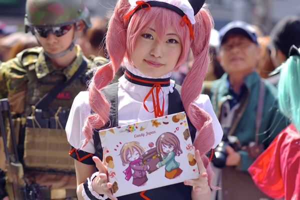
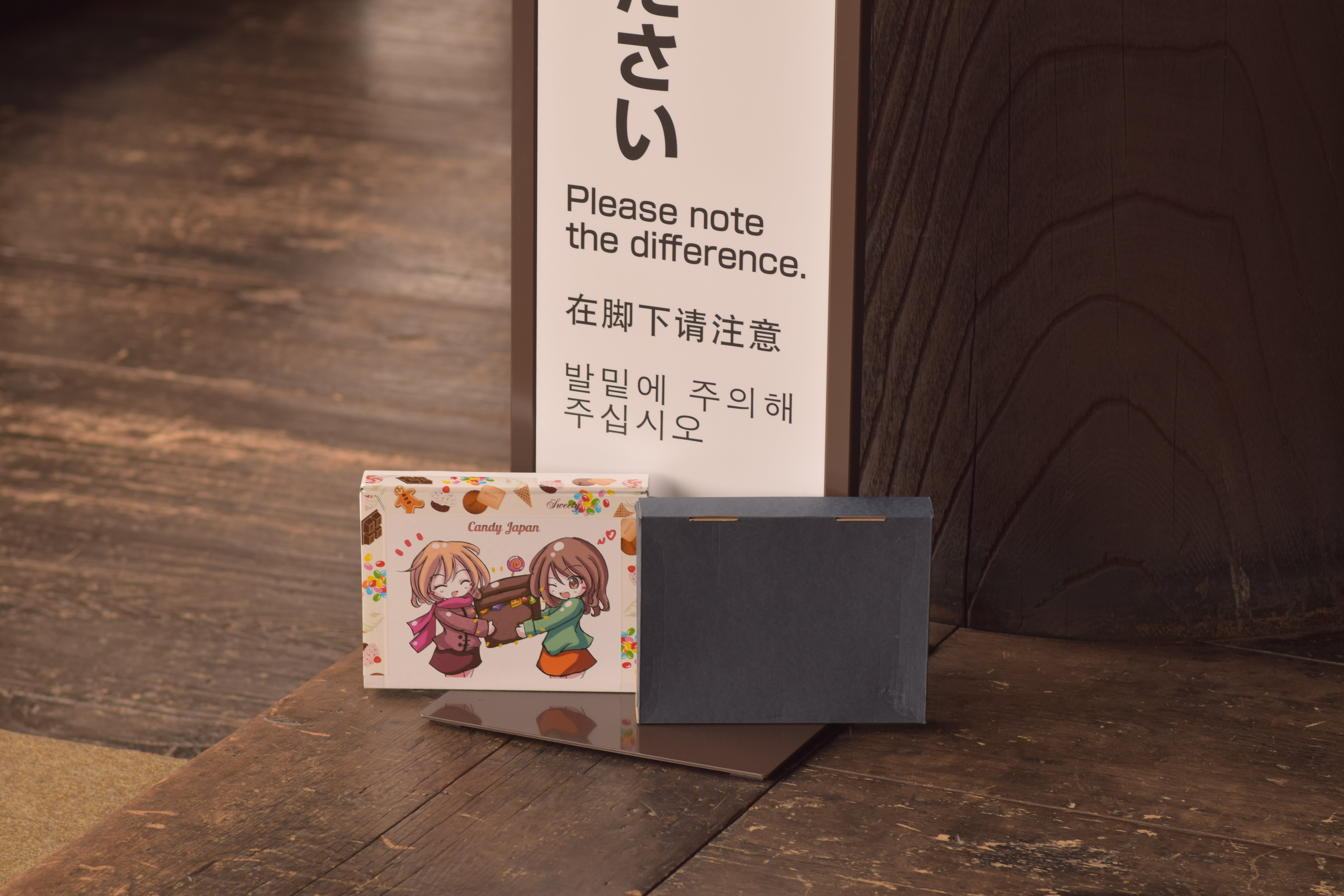
Our original box was just a dark colored parcel with no branding on it. I commissioned a new design and assigned customers randomly to either receive the new packaging (group A) or the old one (group B).
Plain unbranded boxes go for just $0.34 a piece, while a box with a full-color illustration printed on the cover costs almost twice as much: $0.67.
This may not seem like such a big difference, but in absolute terms using the new box means around $500 less profit per month or roughly 10% of profit margin.
Result
The test ran for 4 months and 2 weeks. During this time 6458 packages were sent to 1075 distinct customers. Customers who started a subscription and canceled before receiving their first package were excluded from the test. Of the remaining customers 38.93% canceled during the test.
In group A 38.27% or 168 of the 439 customers receiving the new package design canceled during the test.
In group B 39.59% or 175 of the 442 customers receiving the old package design canceled during the test.
This is not a statistically significant difference. In a world where it makes no difference which package is sent, you would get a result as significant as this 80% of the time.
Conclusion: no clear improvement to retention
Will this mean Candy Japan will stop using the new packages?
Not necessarily.
Retention is not the only reason for having a nice package, and possibly not even the most important one. I can immediately think of at least three other effects which could be more important:
- YouTube unboxings may look more appealing and having the brand name on the box may remind viewers of where to go to subscribe.
- Friends who come over to eat the candy with you will be able to see the company name on the box and may not have otherwise known where to go to subscribe.
- When including product pictures on the homepage, a nicer box may persuade more people to sign up. Sadly the first two effects will only result in direct visits and seem to be impossible to measure. The last reason seems to be measurable, but in practice it would be difficult to take pictures in such a way that the only difference would be the package design.
Thanks to Marek Gibney (creator of www.productchart.com) for calculating the p-value.
You can find the anonymized subscriber data and code for calculating the cancellation percentages here.
You can sign up here if you would like to receive the candy.

