

A/B testing original Candy Japan design vs. random template bought from ThemeForest
Update: this whole result is wrong. Full explanation here: Previous A/B result invalid due to cookie bug
I run a Japanese candy subscription service called Candy Japan, and periodically try to improve the landing page. It's dark magic to me, as I don't really have a great feel of what convinces someone to subscribe. The best I can do is to try to imagine what might improve sales, then compare a change against the original to see if it really is resulting in more sales.
Little data
It would be most satisfying to do this one small tweak at a time, as then I could know exactly what change drove the improvement, but with limited amounts of data this is rather hard to do. For example if you want to test a tweak that results in 5% more conversions, you need about 3000 sales to detect it! For Candy Japan this would mean waiting for about 10 years for the test to complete.

Even if you never reach statistical significance, all things being equal it is still better to follow the result of the test. If you had to play one of two slot machines and someone told you that they played each one 30 times and machine A paid out 10% more than machine B, would it not still be the best choice to choose machine A even if you can't be very confident about the result?
Why test entire landing pages at a time?
My mental model of the landing page is that every little element (and its position) on the page will have its own impact on sales. Most changes to these elements make very little difference, but some will have much bigger impacts. Perhaps there are dozens of elements on the page that each have a small ±1% effect, then the occasional ±10% one. If I picked an element at random and tested it, it would likely be one of those small effects.
But what if I just tweak everything and test that? The small effects would likely end up partially canceling each other out, not resulting in a big effect. But I would likely also end up flipping those larger elements as well, and with a bit of luck not in completely opposite directions. It's possible I could introduce one change that does a +10% and at the same time another one that does -10%, roughly canceling each other out, but it seems it's still a better test than picking just one element at random.

If I pick an element at random I only have a small chance of hitting a significant change, but mixing everything up I'm bound to change some big things as well. Besides that the results would also be more exciting, as I mess both up the result would be disastrous, but if I happened to improve both they would multiply each other, resulting in more than twice as big an impact.
Test setup
With this justification, I put in about 2 weeks of time to test a completely new landing page design. To get something completely different, I bought a landing page template off of ThemeForest and customized it. That was a lot more work than I thought it would be, as I discovered that trying to understand someone else's HTML and make it do what you want can be as much work as just writing it from scratch.

Besides changing the code, it also required new photo assets and copy that I did not have, so I had to sidetrack a bit to create those as well. But finally I managed to customize it to be mostly as I wanted it to appear. To see the difference, you can see the old landing page here, and the new one here.
Below you can see them side by side, but it's better to click through the links above to see each properly, as the pages are quite tall and narrow.

It would be confusing if you got a random landing page design every time you refreshed the page, so when a visitor came to the site, I would pin them to a randomly assigned landing page design, such that on subsequent visits they would be served that same design again.
Results
I personally thought the new design looked better, although I was not very confident about that. I hoped it would win, because that would mean an increase in sales. On the other hand I wouldn't be too disappointed if it lost, since I preferred working with my old familiar HTML rather than the newly adopted one.
I let the test run for a bit over three months. During this time there were a total of 67 new subscriptions. Of these 58% (39) came from the new design and 42% (28) came from the old design. Looks like the new one is likely to be an improvement.
I neglected to record how many views each version had, but should be at least 3000 since the conversion ratio is about 0.5 - 1%. I used http://www.abtestcalculator.com/ and entered 3000 participants -> 28 conversions and 3000 participants -> 39 conversions.
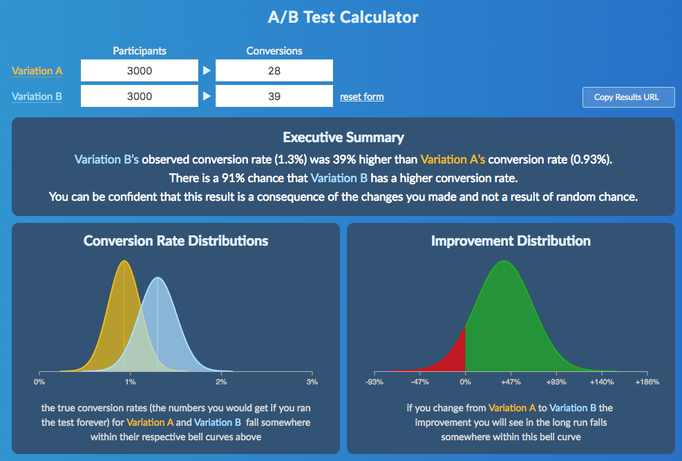
There is a 91% chance that Variation B has a higher conversion rate. You can be confident that this result is a consequence of the changes you made and not a result of random chance.
At first I took this to mean that the result was statistically significant, but many on Hacker News pointed that it probably is not.
Conclusion
I'm pretty happy with the results, the test took longer to set up and run than I would have hoped, but it seems likely that this it increased conversions.

It seems that for a developer like me, customizing a ready-made template is at least as good a way to go as trying to design everything from scratch by yourself. It could be that the difference was just in the assets I had to create in order to be able to use the new template, but in any case it pushed me to create a better landing page.
Thanks for reading. If you would like to receive surprise boxes of Japanese candy, you can subscribe here.